Our tools monitor millions of native, push, pop, and TikTok advertising campaigns.
Get StartedNative advertising is the branch of advertising that specializes in creating ad content that blends seamlessly with the environment. It thrives in camouflage, acting as if it is native to the page or platform. In a way, native advertising blurs the line between advertisement and featured content.
However, as much as it is a great strength, it can also be a brand’s weakness. Many people make the mistake of choosing the wrong components for their native ads, and one of the biggest mistakes of them all is not selecting the proper picture to accompany the content. When your ad blends content and product selling, you better be eagle-eyed in choosing the photos.
If you don’t want your ad to be the laughingstock of not just the native advertising world, but also of your target customers, avoid these types of stock images at all costs!
Whatever it is that this old happy couple is holding and smiling about, they should definitely put it away. When creating a native ad, you do not want any confusion to arise from the reader because it breaks the momentum of the ad itself. By choosing a weird picture like this, the weirdness and unaesthetically pleasing imagery from this picture just do not warrant any sort of attention at all. Plus it looks really gross, don’t you think?
In what looks like a poster for a horrible indie horror movie, a random foot is seen rising from inside a toilet in utter defiance of God and all humanity. In times like this, you would want to ask yourself “What kind of brand would need an image of a foot that looks like it is out for revenge?”
The answer is nothing. No brand would ever need something like this.
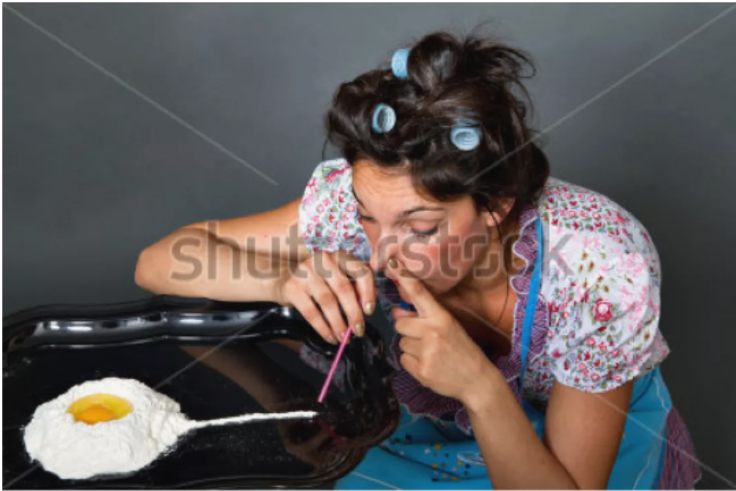
In this picture, this busybody looks like she gave in to the
sweet and creamy scent of her addiction – which is apparently baking. Unless
you are creating an ad for a local lawyer that specializes in baking-addiction
cases, please stay away from this picture too.
In what seems like a very dark take on humor, this nurse seemingly guarantees a two-thumbs-up rating for an untimely demise. Whether she takes side jobs from time to time or just does this purely for fun, one thing we know is that this can never be used for an ad, unless for a hospital in a world where John Wick lives.
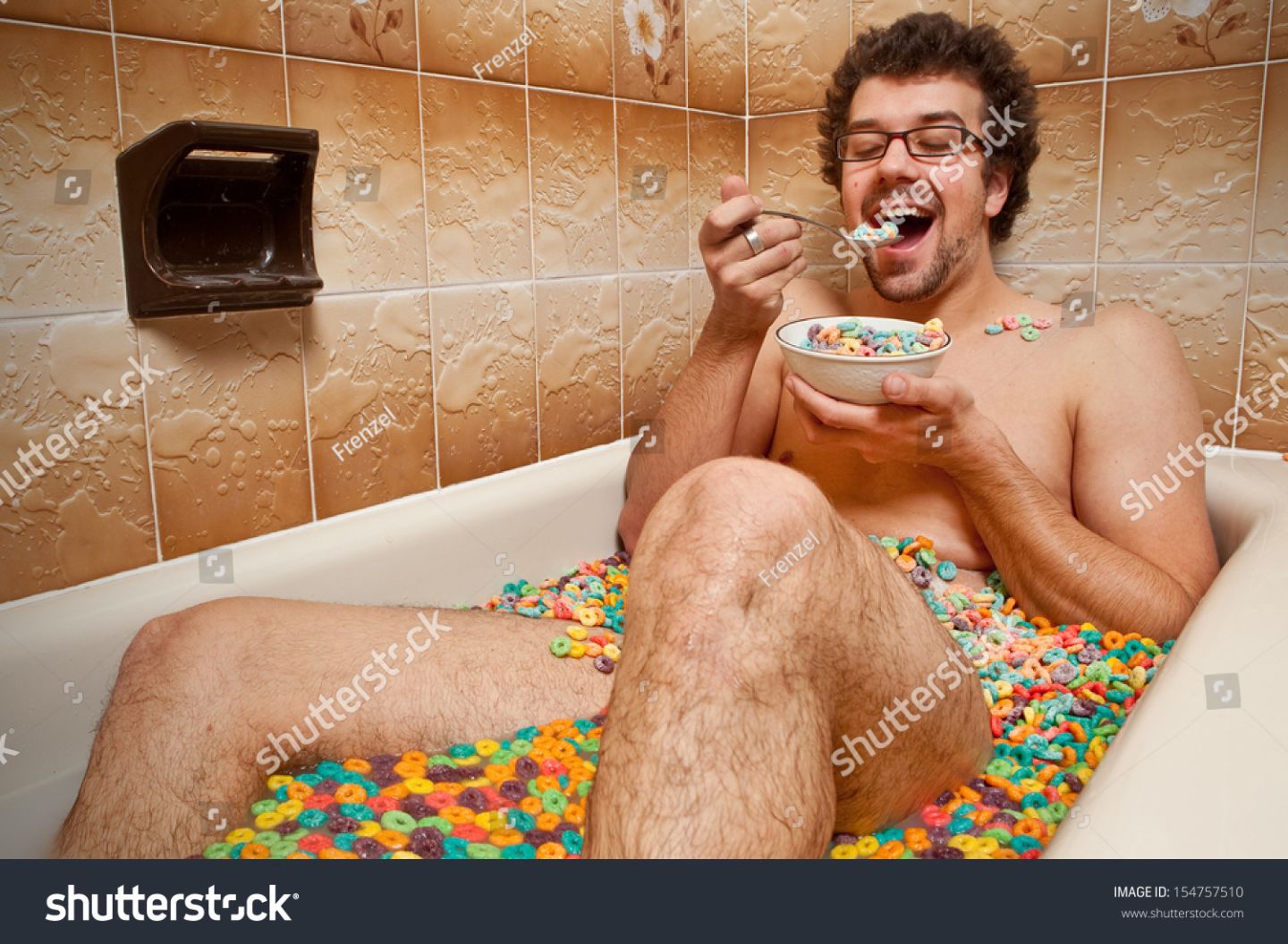
In what may be one of the most downright unneeded and unnecessary images on this list, this guy looks like he is having a weird blend of bath and breakfast in a bathtub, surrounded by tub floaters that might also double as second servings. Not only is this image plain weird, but it is also just unsanitary. Who would want to eat food that has already touched their groin? Might only be a chosen few, we reckon.
Well, now they are just creating nightmare fuels that we will, unfortunately, remember when we are alone in the house, or just before you go to sleep. For those who are wondering where Big Bird came from and if he did have any family, that answer is finally here. Look, this bird person is even trying to teach its captive a thing or two about proper grammar!
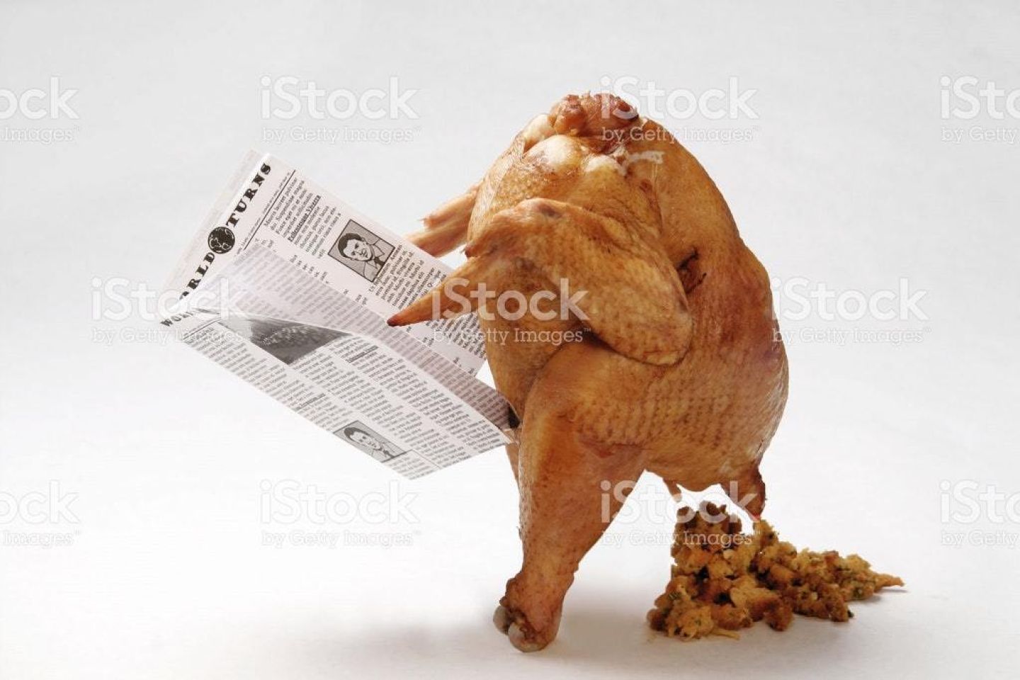
Not everyone likes Thanksgiving turkey or just poultry in general, but it seems like the creator of this stock photo wanted to really gross everyone out! What would you even use a pooping roasted turkey for? Unless you want people to see their dinners for the second time, this is definitely a no-go. This would be a good one for a meme, but never for an ad.
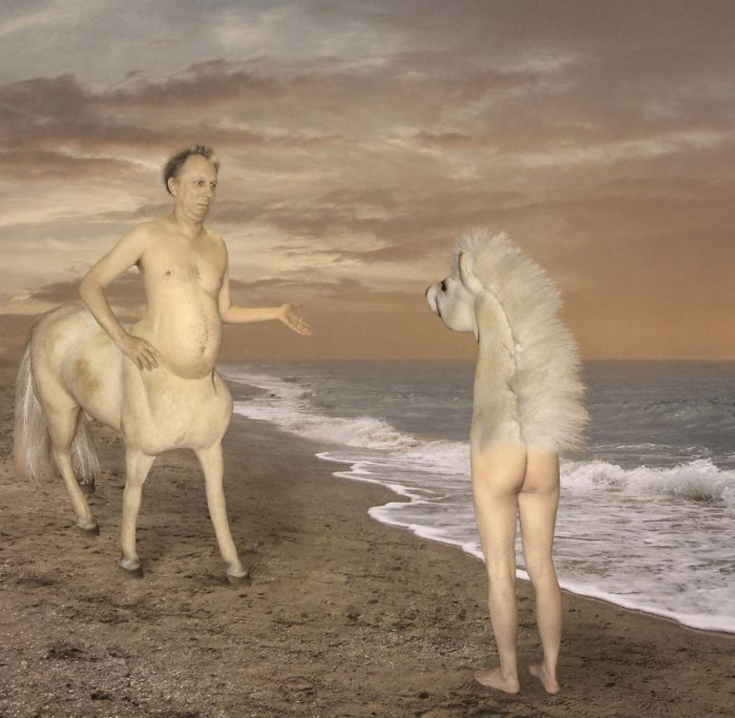
Not only does this image stink of bad Photoshop, but it also features elements that are out of this world! Whether it is about the romance of finding your better (horse)half, or maybe an ad for a Tinder-like app that aims to hook up magical creatures from the fairy world, the one thing that is undeniably attention-grabbing in this image is how the centaur guy looks like he’s asking the other horse person “Why the long face?”
Now, I don’t know about you but this image screams murder, and it looks like it is the cover of the next murder mystery novel that will get a silver screen adaptation. Or by the way she touches him, she’s thinking of doing something sexual to this poor dead guy! Do not use this image for whatever reason you might think. Native ads aim to connect with potential consumers, and there would not be much connection when your audience is creeped-out by those crazy eyes!
These are just a few of the most disturbing and weirdly-made stock photos in the face of the internet. Remember, native advertising is about catching attention while blending with the environment. If you do not want to break the spell that native ads make when in action, then don’t choose ridiculous images that will just scare your visitors away!
Receive top converting landing pages in your inbox every week from us.
Quick Read
Coordinating ads across multiple channels can significantly amplify your marketing ROI. Learn how to create a unified strategy that aligns messaging, timing, and targeting across platforms like Native, Push, and Pop. Discover how seamless cross-channel integration enhances brand recall and drives more conversions. Ideal for marketers aiming to make every ad dollar count through smarter coordination.
Marcus Chen
7 minDec 7, 2025
Case Study
TikTok has emerged as a powerful advertising platform for e-commerce businesses looking to drive sales and grow their customer base. This case study from Peru demonstrates the immense potential TikTok holds for e-commerce businesses.
Kulwant Nagi
7 minJul 14, 2024
Featured
TikTok is a key growth channel for Shopify in 2024. Start by adding the TikTok sales channel in Shopify, linking TikTok For Business, Business Center, and Ads Manager, and installing the TikTok Pixel with your chosen data sharing level. In Ads Manager, build campaigns → ad groups → ads, pick Product Sales (with a linked catalog), target by demographics/interests/behavior, and set a daily or total budget (often $20–$50 minimum). Test optimization goals—Clicks, Landing Page Views, and Conversions—to see what scales. Use short video creatives, Spark Ads, creator content via post codes, clear CTAs, and relevant keywords/hashtags. After approval, track analytics and iterate. For strategy, use Anstrex In-Stream to research competitors by filters, keywords, products, and stores, then model high-performing, demo-style, localized ads.
Jairene Cruz
7 minApr 25, 2024

