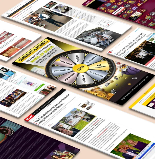
Our tools monitor millions of native, push, pop, and TikTok advertising campaigns.
Get StartedIn sales and marketing, your first “contact” with your target audience is through advertisements – and in any form of media, these ads always start with a simple yet often overlooked component: the Call To Action (CTA). Without a good CTA, the odds of your ad getting noticed is low, which is something that you wouldn’t want for your business.
As you may know, advertisements are extremely powerful – especially if used correctly. Apart from enticing and/or powerful images and headlines, a short yet appealing Call To Action makes or breaks an advertising campaign. Fortunately, finding the perfect CTA for your ads is possible with the help of these pointers.
The main point of a CTA is to tell your audience what to do – exactly the way you want them to do it. This not only ensures that you get better conversion rates, but it also enables you to provide a better user experience for your visitors. This sounds like a pretty straightforward approach, right? Yet a lot of advertisers still fail to achieve the results they want – mainly because the CTAs are not clear and concise.
Most people don’t have the time or the patience (or both) to scroll down and read everything – so it is best to help your audience navigate through your page. To get your readers to stay interested, try to incorporate the following into your landing pages.
Establishing your credibility can be achieved by speaking with authority and confidence – which could be a bit tricky to convey through written words.
With only a short time to capture your audience’s attention and with just a few words to do it, you have to make sure that your audience knows that you are the authority when it comes to the topic.
The most common CTAs are popular for a reason – they get better click-through-rates and in turn have the better potential for conversion. However, since the length of both your CTA and your headline is limited to a few words, they might get repetitive through time. To avoid using the same ones throughout your campaign, here are some examples of common CTAs and the alternatives you can use.
To “Go Big” in this sense is to make sure that you highlight your Call To Action in every way possible, so it can properly serve its purpose.
One sales strategy that might never get old and will continue to give your CTAs an edge over the others is providing rewards. Use rewards to make your call-to-action more enticing: adding freebies, discounts, or any kind of bonus can get more users to interact with your advertisements.
With rewards, while you are already providing the service or product that your customers expect, you are also adding value to what you are selling. The added value of benefits drives better conversion rates simply because customers are getting more bang for their buck.
Receive top converting landing pages in your inbox every week from us.
How-To
Kick off the New Year with high-impact InStream ads that capture attention and spark excitement. Learn how to craft video content that builds anticipation, encourages engagement, and drives conversions. Discover targeting strategies and creative techniques to make your campaigns stand out. Perfect for marketers looking to start the year strong with buzz-worthy video advertising.
Priya Kapoor
7 minDec 24, 2025
Tips & Tricks
A well-optimized landing page can make all the difference in your pop ad performance. Learn five proven techniques to boost conversions through better design, messaging, and user flow. Discover how to align ad intent with landing page content for a seamless experience that drives results. Perfect for advertisers looking to turn more clicks into customers.
Marcus Chen
7 minDec 23, 2025
Quick Read
Holiday marketing success often comes down to choosing the right communication channel. Explore the strengths of push notifications and email marketing to see which drives better engagement and conversions. Learn how to combine both for maximum reach, personalization, and festive impact. Ideal for marketers aiming to craft winning holiday messaging strategies that truly resonate.
Samantha Reed
7 minDec 22, 2025


